- Windows 11 Start Menu Is Getting Mixed Reactions
- Some people don’t like the size, although others think it’s fine
- There are also complaints about lack of customization in some aspects.
Windows 11’s new Start menu is proving controversial as the revamped interface continues to roll out; That’s clear.
Some people aren’t very impressed with Microsoft’s overhaul here, while others appreciate the redesign more. And aside from the opposing sides, there are other people who are upset with the new interface, not because they hate it or like it, but because they don’t have it yet.
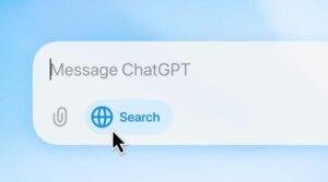
Windows Central pointed out a thread on Reddit, which is a great example of how polarized the debate around the new Start menu has become, where the original poster asked “What do you think about the new Start menu update?”
And boy, did they have some thoughts, some of which were spicy or even downright fiery.
The main complaints expressed are two. Firstly, the Start menu is too large in its new form, and secondly, there is a lack of customization, which makes the panel difficult in certain aspects.
size matters
The question of the size of the redesigned Start menu is a complicated one. In the linked thread, there are multiple complaints that it’s big, or huge, or in fact, as one Redditor said, “So big, it’s basically a Home screen again.” This refers to the configuration of this part of the interface in Windows 8 (as full screen, not a menu outside the taskbar), which was a move that caused a lot of hate in the Windows community at the time. (Microsoft was trying to create an operating system suitable for tablets and touch screens, as well as desktop PCs.)
There’s a similar sentiment on another Reddit thread, where someone observes: “The new Start menu is basically a second desktop.”
The predominant feeling among a few people is that the redesigned menu practically takes up the entire desktop and, as a result, feels suffocating. And that’s especially true if you have the Phone Link panel enabled, which floats to the side and takes up more space.
However, there is a nuance here, and the actual size of the Start menu depends on the size of the screen, as well as the resolution (and potentially the scale of the interface). In short, there are some mobile variables here, but different Windows 11 PCs will have a smaller (6 columns) or larger (8 columns) Start menu depending on the space available to display the interface. And it’s the people who get a broader view of the UI who complain the most.
There are tricks to force the 6-column version to be enabled, instead of the larger variant, and that’s what a lot of size-haters are turning to. (Either that, or third-party customization apps.)
However, there are more than a few Windows 11 users who have no problems with the Start menu (they appear to be running the 6-column version)
So not everyone is unhappy. However, even with the most compact design, depending on the screen size and resolution combination, there are still people who complain that there is too much wasted space here (spaces between icons and sections where the UI size seems to go wrong).
Design options
The other main issue being aired on Reddit is that the Start menu doesn’t offer enough customization. In fact, this has been a controversial area since the revamped UI was first revealed almost a year ago.
This is mainly due to criticism against the category view of the app list, which is a good idea in theory in terms of making that list fit into a more organized and compact space. However, Microsoft has automated the grouping of those categories and Windows 11 doesn’t do a great job of that.
Things related to PC games in particular can be placed all over the place, and the feedback is largely negative in terms of how apps are categorized, particularly because a ton of software is simply dumped into the “Other” category (meaning Windows has no idea where it should go).
This wouldn’t be such a big deal if you could reset all of this yourself and change the icons manually, but you can’t. There is no way to move apps to different categories, rename categories, or create new groups. People are quite frustrated with Microsoft’s decision here, and I have to agree that it seems very strange that this point of view cannot be changed.
However, there is praise for one major personalization twist that is present in the new Start menu, and that is the removal of the section containing Microsoft’s “recommendations”, and I wholeheartedly agree that this is a very welcome touch.

It’s telling that the top-voted comment in the ‘thoughts’ Reddit thread curated by our sister site, Windows Central, is this: “I’ll tell you my thoughts when I finally get it.”
This includes me, because I still don’t have the revamped Start menu on my Windows 11 laptop or desktop. I’m not alone, as there are a surprising number of comments lamenting that the redesigned UI hasn’t arrived yet.
This is surprising since the full rollout officially began in November 2025, so it seems like Microsoft is taking its time during the rollout.
For some, then, the wait continues, and for others, their wish is that they never received the new Start menu in the first place. Perhaps Microsoft is now considering implementing more customization, at least for that category view.
The best laptops for all budgets
Follow TechRadar on Google News and add us as a preferred source to receive news, reviews and opinions from our experts in your feeds. Be sure to click the Follow button!
And of course, you can also follow TechRadar on YouTube and tiktok for news, reviews, unboxings in video form and receive regular updates from us on WhatsApp also.