- YouTube is rolling out a big update to its display screen on TVs
- There is a new Description button and an improved Subscribe button.
- We also get relocated video titles and new controls for live sports and more.
When we reported on plans for the much-needed redesign of the YouTube TV app in April, we said it would be coming “soon.”
Well, it turns out that Google’s idea of ”soon” is very different from ours, and when Google said “summer” it meant “winter” (at least for those in the northern hemisphere). Still, better late than never – this update is rolling out now and will improve your YouTube TV app.
Google says the TV viewing page update offers “a smoother, more intuitive experience with easier navigation, better accessibility controls, and fewer interruptions.”
It’s rolling out now to smart TVs and streaming boxes like Apple TV (we can confirm it’s now coming to the latter). This is the new…
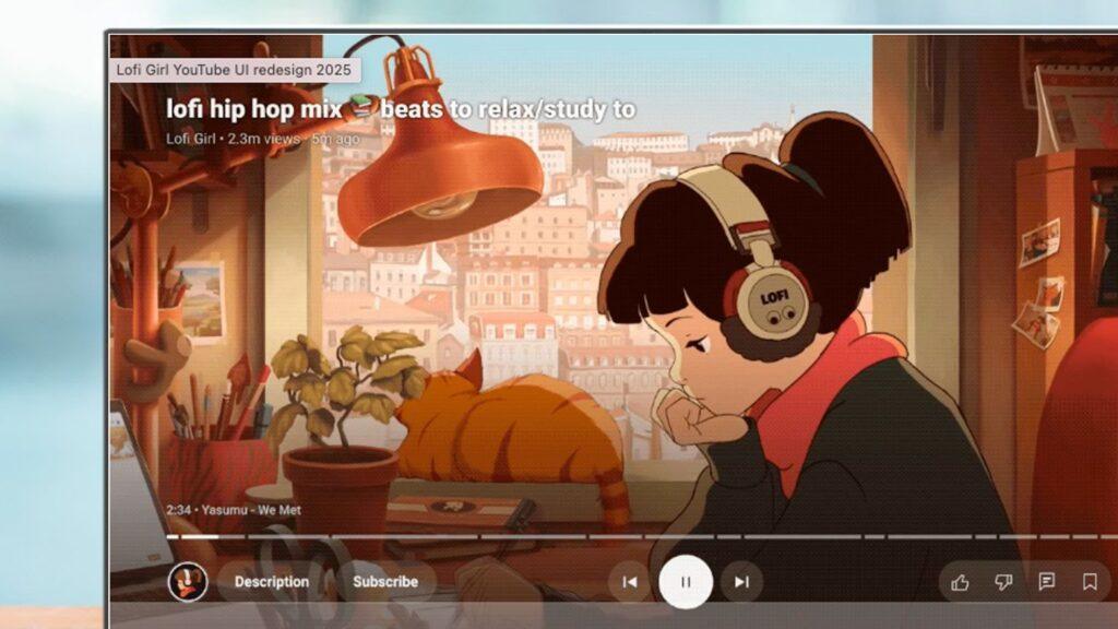
1. Controls reorganized
The on-screen controls are now organized into three clear sections immediately below the video debugger.
On the left you have the channel, description and subscription controls; In the center you have the previous, pause and next controls; and to the right are the controls for like, dislike, comment, save, captions, and settings.
2. Relocated video titles
The video titles have been moved. You will now see them at the top left of the player screen and you will no longer be able to click on the titles.
That fits with the single teaser image Google released in the spring, which showed that change very clearly.
3. A new Description button
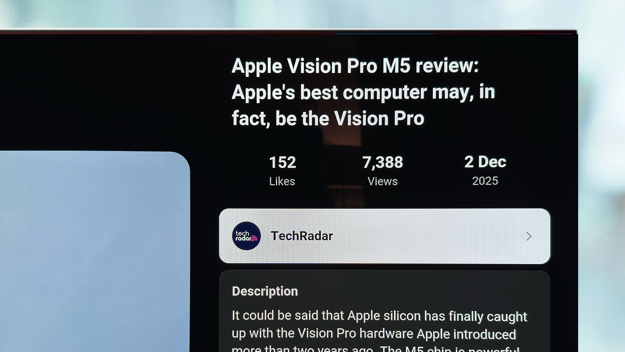
The new Description button (which you’ll find to the left of the playback controls, next to the channel icon) replaces clickable video titles and lets you see key information about the current video.
Tap the button and you’ll get the sidebar above, which includes details about the creator, video metadata, and a preview of comments. You also get quick access to any video chapter, which is quite useful, plus a “how this was made” box, which tells you if any of the videos were AI-generated.
4. An improved subscribe button
The subscribe button is now always visible in the playback controls and is separate from the channel thumbnail. Basically, that means one less click if you’re watching a video and want to subscribe.
The button will also be adjusted so you can see if the content is paywalled and will also allow you to set up notifications for upcoming live streams. Which could come in handy for those big tech conferences in 2026.
5. More new controls
If you’re watching live sports, you’ll now see the Multiview control, and if you’re a Music or Premium subscriber you’ll see the Viewing Mode control.
Google had previously promised that Multiview would also include non-sports content, but unfortunately there’s no sign of that in this update so far.
None of these changes are particularly earth-shattering, but they are all welcome improvements to an interface that definitely needed a makeover, and also makes it more consistent with mobile apps.
Follow TechRadar on Google News and add us as a preferred source to receive news, reviews and opinions from our experts in your feeds. Be sure to click the Follow button!
And of course you can also follow TechRadar on TikTok for news, reviews, unboxings in video form and receive regular updates from us on WhatsApp also.