Spotify has the edge over the best music streaming services because of its hyper-personalized feed and social features, but its app design isn’t the best.
I’m not the first power user to criticize the platform for its stuffy and sometimes disorganized design. The ‘Your Library’ section, for example, is a group of your recent activity, which you can only rearrange using the filters at the top of the screen; Complete customization is out of the question.
After using Spotify alongside Apple Music, there’s no comparison: the latter includes a simple and concise interface, with a glossy and sleek finish, and Spotify could certainly take a page from Apple Music’s book on the organizational front. However, at least one user found a hidden setting that allows you to switch from Spotify’s dark color scheme to a brighter one similar to Apple Music.
A Reddit post shared by u/Hot_Perspective (see below) shows two images of the Spotify mobile app with inverted colors enabled, essentially replacing Spotify’s dark appearance with a ‘light mode’ one consisting of an all-white background reminiscent of Apple Music’s interface.
Do you know that you can use Spotify in clear mode on iOS? It looks nice 😍 from r/truespotify
The thing to note here is that it’s not actually controlled through the Spotify app; It’s all done through iOS or Android settings and is easy to enable.
If you’re using an iPhone, open Settings and head to Accessibility, then tap Settings by app. From there, you’ll need to tap Add App and search for Spotify. Once you’ve added Spotify, select Smart Invert and enable the option. Android users can also enable this feature by heading to Settings and tapping Accessibility, then Text & Display. Find Color Inversion and turn it on.
what a monstrosity
If you haven’t come across this tool yet, it’s a big difference from Spotify’s traditional dark theme interface, to say the least.
While it flips the dark color scheme of the app on its head, it’s smart enough to know not to invert album and playlist covers, so not all parts of the Spotify app are inverted, which I think is pretty smart. But despite its accessibility benefits, it hasn’t been a huge hit with music fans, myself included.
On the one hand, it does not solve the problem of cluttered and disorganized interface, it simply adds original colors to the application. Other than that, it’s insanely bright, I’d say even brighter than the average smartphone display setup; the meme responses on the Reddit thread have made me laugh (see the countless reaction images).
I can’t explain it exactly, but there is something very “disturbing” about Spotify with inverted colors. It looks a bit like Apple Music, but I know it’s not. I even lost my muscle memory while trying to navigate it; That puzzled me a lot.
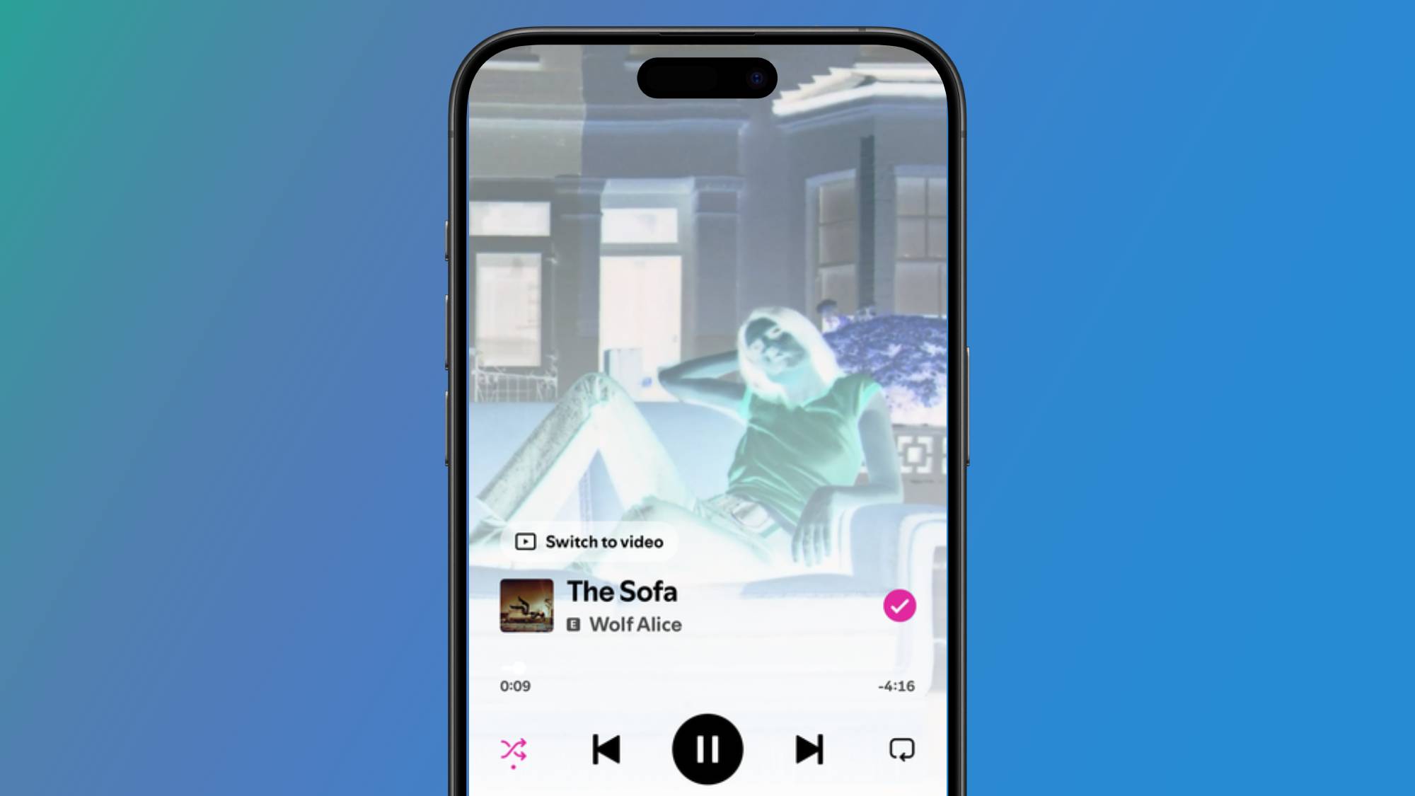
As we all know, Spotify loves good visuals and most songs on the platform feature a short looped video in the playback section of the app, but inverted colors interfere with this, making the images look like X-rays. But even if you like the look of them, it has a knock-on effect for both iOS and Android smartphones.
Because Android doesn’t allow you to enable this tool for individual apps, you’ll have to endure inverted colors system-wide, which puts a lot of strain on your eyes. While iOS allows you to enable inverted colors for separate apps, you must have the system-wide Light Mode setting turned on for it to work. This means that if you’re like me and prefer to use dark mode on apps like Instagram and iMessages, you’ll have to sacrifice it—it’s an all-or-nothing situation.
I think it’s appropriate to say that it generally doesn’t sit well with many subscribers. However, it reminds us that while Spotify still has some design issues to iron out, at least the platform has a solid brand identity.
![]()
Follow TechRadar on Google News and add us as a preferred source to receive news, reviews and opinions from our experts in your feeds.